Jurriaan Molenaar Dutch, b. 1968
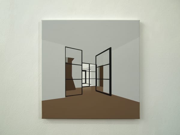


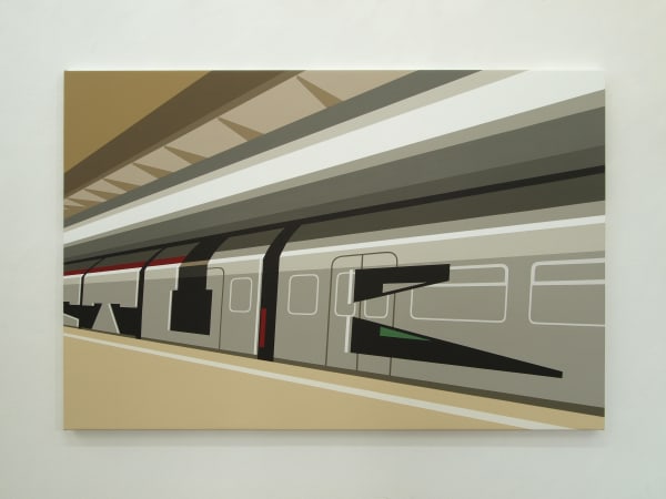

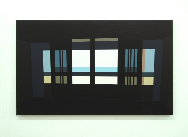


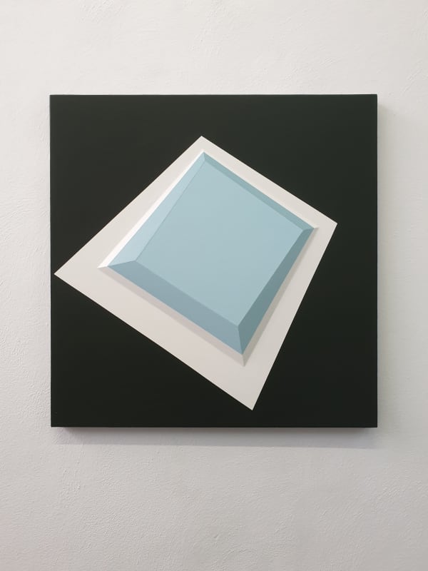
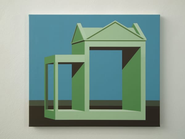

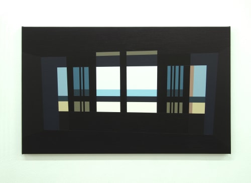
Jurriaan Molenaar (*1968) paints architecture: residential boulevards, industrial areas, banks and offices. Often empty spaces that offer a view to even more emptiness. A clear fascination can be recognized for the work of architects such as Le Corbusier, Mies van der Rohe and their interaction with the relationship between inside and outside. For Molenaar, establishing connections between these two elements is essential. To achieve his goal, he uses sober, muted colors, labyrinthine perspectives, razor-sharp lines and an almost invisible brush.
He himself calls his way of painting "constructed realism", with no other storyline missing. He says: "In my 'buildings' the 'visitor' is given the silence and space as a gift. Architecture is not much more than walls and holes. But a wall has a double psychological charge: it insulates you and also offers protection. With a hole it's just like that: you can peek through it, but can also be looked at. I want to show all of that in my work. "
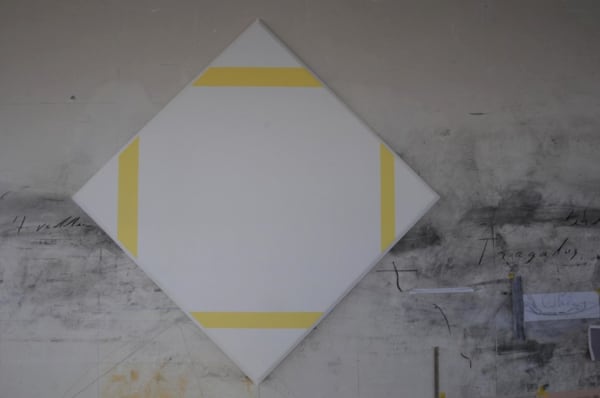
The studio of Jurriaan Molenaar is extremely neat, the walls clean and straight, his large worktable tidy. On the floor are hundreds of pots of pigment, a sea of colour almost incongruous in this austere 'architecture studio'. Line, light and space define the image in the paintings of Jurriaan Molenaar.
This 'science-man' has mastered the laws of perspective and geometry down to the finest details. Windows in a wall, a swimming pool, an open door. They are like tests in traditional geometry with the complication of different vanishing points. Molenaar looks for leeway in the geometry, leeway in the perspective and the vanishing points, without, however, violating these. At first sight very realistically represented, further insight reveals that there is nevertheless a slight torsion in the shape of the swimming pool and the aspect of the window in the wall is almost implausible; leeway in what seems real. In Molenaar's paintings colours are restrained and monochrome. In order to suggest depth or light he uses no changes of tone or colour. The areas of colour are, however, painted with extreme precision, and also remarkable sensitivity. And this is where the warmth lies, the poetry, for the contemplative viewer.
-
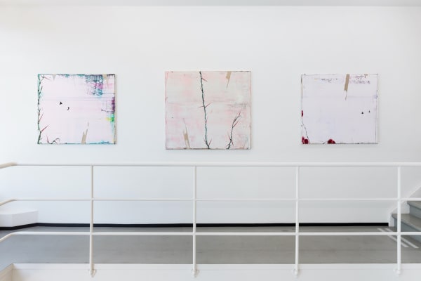
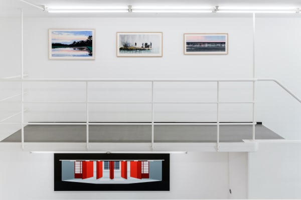
Homage to Jan
Jan Andriesse & Jurriaan Molenaar 16 Apr - 16 May 2025In August 2021, Jan Andriesse (1950) passed away. For over three decades he developed an oeuvre defined by light, space, and stillness-yet equally by his precise observation of natural phenomena....Read more -

Art Rotterdam 2025
Stand I-1 27 - 30 Mar 2025In August 2021, Jan Andriesse (1950) passed away. In his houseboat, an oeuvre was created in more than 30 years that is mainly characterized by light, space and emptiness, but...Read more -
Reality Pictured 2.0
29 Sep - 23 Oct 2021Before we 'officially' open the doors of our new exhibition spaces on October 30, you are welcome to visit the exhibition Reality Pictured 2.0 from September 29 - October 23....Read more -
Reality Pictured
3 - 20 Jun 2021It began with Paul Cézanne who, at the start of the 20th century, employed geometric lines to represent the reality of 'his' mountain, Montagne Sainte Victoire. A few years later,...Read more -
Art Rotterdam 2020
Stand 68 5 - 9 Feb 2020RONALD DE BLOEME | JURRIAAN MOLENAAR || MARINUS BOEZEM | CAREL VISSER STAND 68 This year at Art Rotterdam Ronald de Bloeme (*1971), living in Berlin and alumnus of the...Read more -
Lang niet gezien, nog niet gezien
6 Apr - 1 Jun 2019A group exhibition featuring fifty key artworks from the Borzo collection, spanning approximately the past fifty years ; from Leon Adriaans to Bob Bonies, from Jan Schoonhoven to Rakuko Naito,...Read more -
Art Cologne 2017
Stand A1 26 - 29 Apr 2017During Art Cologne 2017 we will show a number of beautiful reliefs and drawings by Jan Schoonhoven. In addition, we will show a large work by Herman de vries: 'unter...Read more -
Jan Andriesse, Piet Moget and Jurriaan Molenaar
12 Sep - 10 Oct 2015With Piet Moget on the Mediterranean On the Mediterranean by Port-la-Nouvelle Piet Moget has lived and worked for more than sixty years. For many years now we have visited him...Read more -
after zero
12 Nov - 3 Dec 2011In the Dutch art history of the second half of the 20th century, some movements can actually be measured by international standards. They are characterized by innovation, cooperation and group...Read more